Beach watercolor paintings can be simple and enjoyable to create, even for beginners. By focusing on three main parts—the sky, ocean, and sand—an artist can capture the essence of a beach scene with basic shapes and soft colors. Using simple techniques like wet-on-wet blending and layering, anyone can paint a peaceful beach landscape without needing advanced skills.
The key is to keep the composition clear and avoid overworking details. Soft washes can show gentle waves and the smooth horizon, while light color choices help create a calm atmosphere. This approach makes beach scenes accessible and relaxing to paint.
Many tutorials break down the process into easy steps, helping painters learn as they go. By practicing basic strokes and mixing simple color palettes, artists build confidence and improve their skills over time.
What Are Simple Beach Watercolor Paintings?
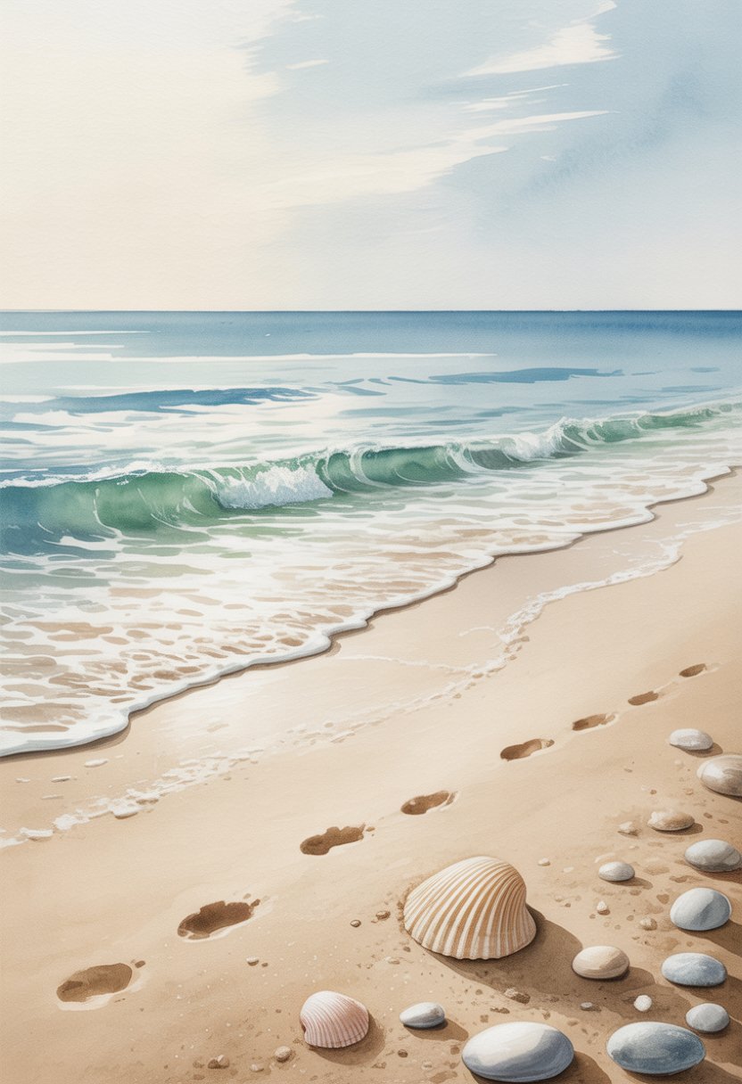
Simple beach watercolor paintings capture the calm and natural beauty of the coast using limited colors and basic shapes. These paintings focus on clear scenes with essential elements like sky, ocean, and sand. They avoid clutter and extra details, making them easy to create and visually calming.
Key Characteristics
Simple beach watercolor paintings use soft, flowing brushstrokes and light washes of color. Artists often work with a small palette including blues, sandy yellows, and soft whites. These paintings show smooth transitions between sky and sea, with gentle waves or smooth sand textures.
They focus on basic shapes rather than complex details. This means broad strokes for water and sky, and simple lines for shorelines or beach objects. The technique often uses wet-on-wet or dry brush methods to create texture with minimal effort.
This style avoids heavy layering. Instead, only one or two layers of paint are used to keep the image clear and fresh. The simplicity helps highlight natural light and color changes on a beach.
Popular Subjects
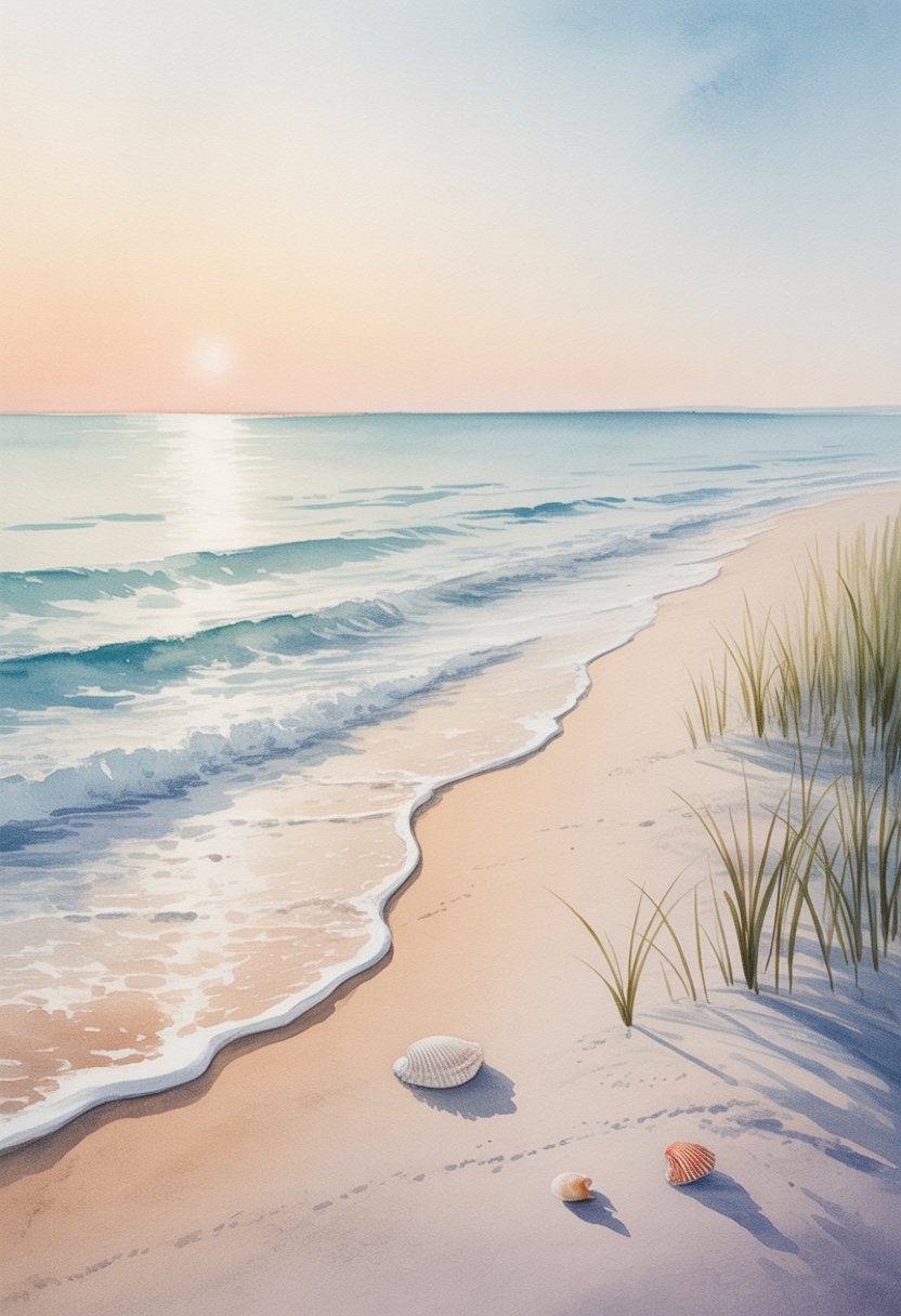
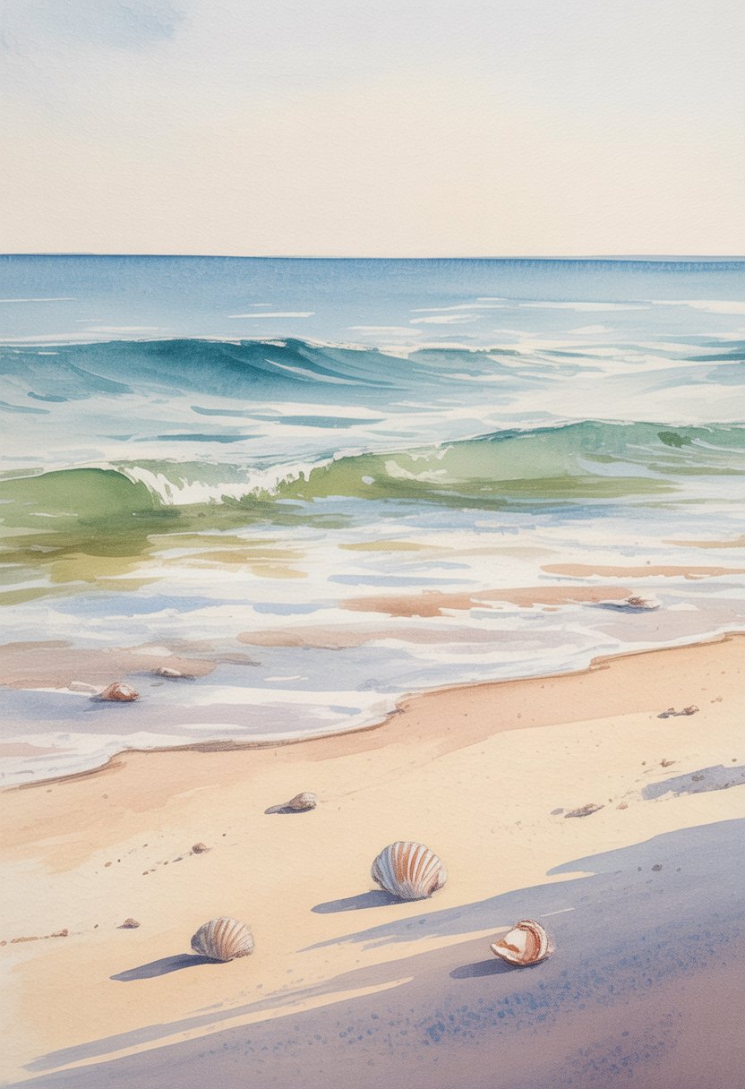
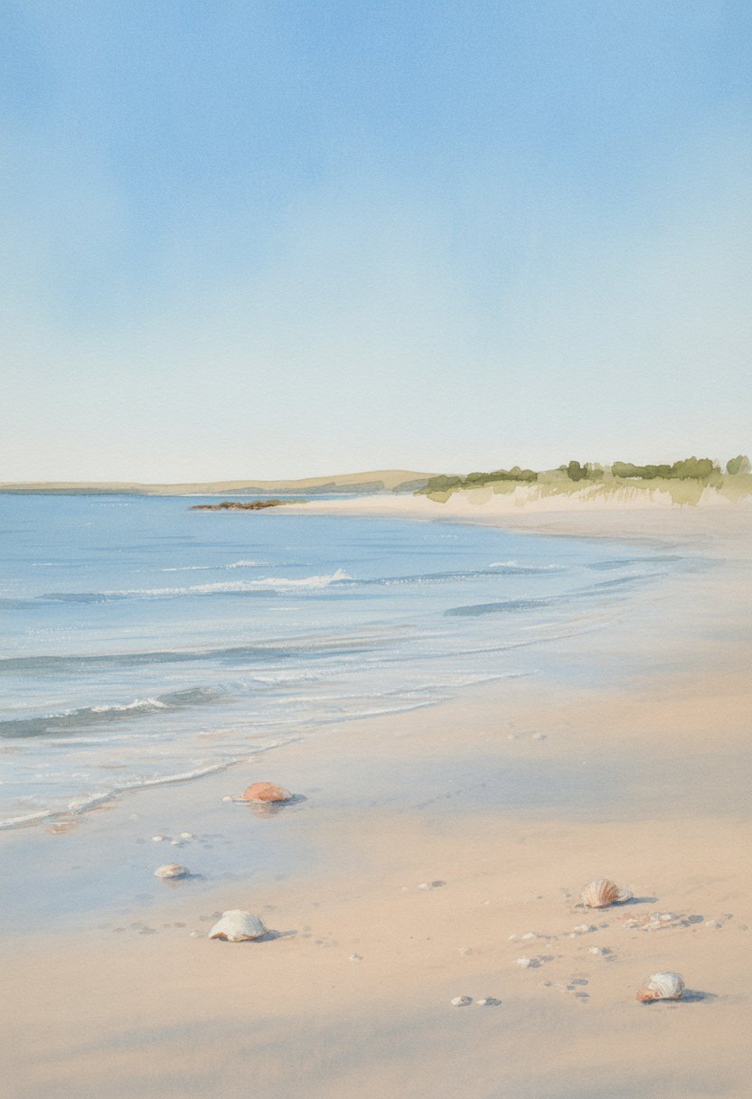
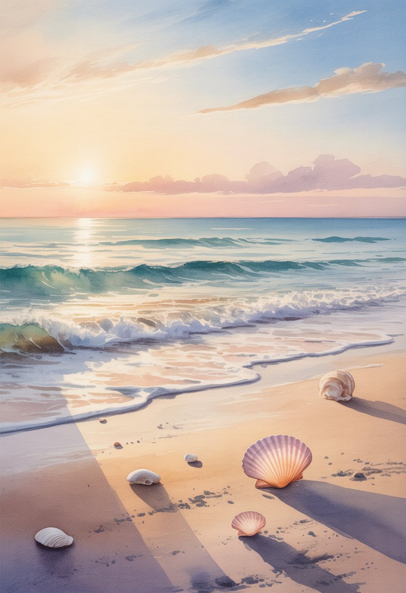
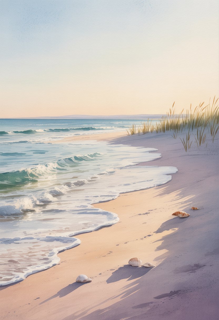
Simple beach scenes often include three main parts: the sky, the ocean, and the sandy shore. These make the viewer feel the space clearly and peacefully. Sometimes artists add simple details such as distant boats, birds, or driftwood.
Clouds are painted with soft, round brushstrokes. The ocean waves appear as light, curved lines or blended washes of blue and green. Beaches are shown as flat, warm areas with hints of shells or footprints, but without clutter.
People and animals are rarely the main focus, but small silhouettes or shapes can appear. This keeps the scene calm and easy to understand without distractions.
Why Choose Simplicity in Watercolor Art?
Simplicity allows painters, especially beginners, to enjoy the process without stress. Using fewer layers and simple shapes helps build confidence and skill in handling watercolors.
It captures the peacefulness of a beach better than a busy or detailed painting. The empty spaces and gentle colors invite relaxation and reflection.
Simple beach watercolors are also quick to finish. Artists can complete an image in one sitting, which encourages regular practice.
This style suits anyone who wants an uncluttered, clear image that represents a beach’s natural beauty without complicated details. It works well for gifts, decoration, or learning basic watercolor skills.
Essential Materials for Beach Watercolor Paintings
Creating a simple beach watercolor painting requires selecting the right paints, paper, brushes, and a fitting color palette. These materials help capture the light, texture, and colors of sand, sea, and sky effectively.
Recommended Watercolor Paints
High-quality watercolor paints improve color vibrancy and blending. Artists often prefer professional or artist-grade paints for better pigment load and lightfastness. Essential colors include:
- Ultramarine Blue for the ocean and sky
- Yellow Ochre for sandy textures
- Burnt Sienna for beach rocks and driftwood
- Cerulean Blue for lighter sky and water tones
Tubes or pans can both work, but tubes allow easier mixing of larger washes. Using transparent colors is important to maintain the glowing effect of watercolor. Avoid colors that are too muddy or opaque for beach scenes.
Paper and Brushes Selection
Paper should be thick and textured to handle wet washes. 300 gsm (140 lb) cold-pressed paper offers the best balance of absorbency and surface texture. Cold-pressed paper allows soft blending while keeping some grain for texture in sand and water.
Flat or round brushes sized 6 to 12 are ideal. Flat brushes work well for broad sky and sea washes, while round brushes provide control for details like waves or distant objects. Synthetic or sable brushes both perform well, but sable holds more water and pigment.
Choosing a Color Palette for Beaches
A limited color palette helps create harmony in the painting. Focus on variations of blue, brown, and yellow tones.
- Blues: Ultramarine and Cerulean Blues capture water depth and sky light.
- Yellows and Browns: Yellow Ochre adds warmth to sand. Burnt Sienna or raw umber give natural beach tones.
Mixing these colors carefully avoids harsh contrasts. Soft gradients between water and sand improve realism. The palette should reflect natural light and avoid overly bright or artificial colors.
Fundamental Watercolor Techniques
Mastering a few key techniques helps artists capture the natural look of a beach scene. Controlling how paint and water move on paper allows for smooth skies, detailed textures, and realistic depth through shadows. These skills build the foundation for simple, yet effective, watercolor paintings.
Wet-on-Wet and Wet-on-Dry Methods
Wet-on-wet means applying paint onto wet paper or over a wet layer of paint. This method creates soft edges and smooth color blends. It’s ideal for painting skies, water, or soft clouds where colors should gently flow into each other.
Wet-on-dry involves painting on dry paper or a dry layer of paint. This technique produces sharp lines and clear details. It is useful for showing objects like beach umbrellas, shells, or birds in the scene.
Using both methods thoughtfully allows artists to balance softness and detail, making the beach scene look natural and inviting.
Creating Texture and Effects
Texture adds interest and realism to a beach painting. Artists can achieve texture by varying brush strokes, lifting paint with a dry brush, or adding salt to wet paint. Salt creates small patterns as it absorbs water, mimicking sand grain texture.
Spattering paint lightly with a toothbrush or stiff brush can represent splashing water or distant sea spray. Using rough paper enhances texture naturally because the paint gathers unevenly along the surface.
Applying these techniques carefully helps transform simple shapes into convincing elements of a beach landscape.
Using Shadows to Add Depth
Shadows give a painting a sense of three-dimensional form and space. In beach scenes, shadows can appear under umbrellas, rocks, or people’s feet. Painting shadows with a diluted mix of cool colors like blue or purple prevents them from looking flat or harsh.
It’s important to observe the light source and place shadows correctly to maintain realism. Softer edges on shadows suggest bright sunlight and diffuse light, common on beaches.
Including accurate shadows guides the viewer’s eye and enhances the overall depth and structure of the painting.
Planning a Simple Watercolor Beach Scene
Planning a watercolor beach scene starts with setting key points that give balance and interest to the painting. The placement of lines and objects shapes the overall look and guides the viewer’s eye. Thoughtful choices here make the landscape clear and natural.
Composing the Horizon Line
The horizon line is the main divider between sky and water. It usually sits one-third from the top or bottom of the paper, following the rule of thirds for balance. A low horizon emphasizes the sky, while a high horizon focuses more on the beach and water.
The line should be straight or slightly uneven to suggest distant waves or land forms, but not too detailed. Keeping it simple helps maintain a calm atmosphere in the painting. This line sets the stage for everything else in the scene.
Arranging Elements in the Landscape
After deciding on the horizon, the next step is placing elements like sand, water, and maybe some beach features. These should be spaced to avoid clutter. Larger, closer objects go near the bottom or foreground, while smaller or faded shapes go toward the horizon.
Using layers of paint helps build depth. For example, starting with a wash for the sky, then adding water, and finishing with sand works well. Including small touches like beach grass or shells can add interest without complicating the scene. Clear spacing keeps the landscape open and easy to read.
Step-by-Step Watercolor Beach Painting Tutorial
This tutorial focuses on capturing the essentials of a beach scene with watercolor, starting from a simple sketch to painting the sand and wet sand. It highlights how to set up the composition and how to create realistic textures for dry and wet sand using watercolor techniques.
Sketching the Scene
The first step is to create a light pencil sketch on watercolor paper. The artist should outline the horizon line where the ocean meets the sky, then sketch the main shapes of the beach and waves. Keeping the lines soft and minimal helps prevent them from showing through the paint later.
It is important to leave space for the wet sand reflections and the dry sand area. Sketch simple shapes, avoiding too much detail, since watercolor requires careful layering. The sketch acts as a guide to place colors and shadows accurately while painting.
Painting Sand and Wet Sand
Start painting the dry sand with a light wash of warm colors such as light browns or yellows. Use smooth, horizontal brush strokes to reflect the even surface of dry sand. Let this layer dry completely before adding texture.
For wet sand, use cooler and darker tones like muted blues mixed with brown. Apply paint in thin layers to create the look of shiny, reflective wet sand. Adding a few soft, horizontal reflections improves the realism. Wet sand should appear smoother and glossier than dry sand, so blend colors lightly.
Using water and pigment control helps to show the difference between dry and wet areas clearly. The transition between them should be gradual, with wet sand near the shore and dry sand farther back.
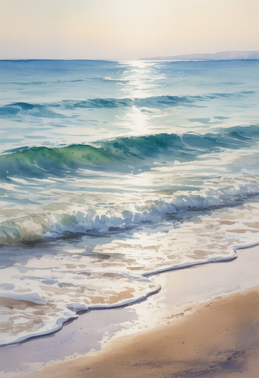
Painting the Sea and Ocean Details
Painting the sea in watercolor requires attention to the way water moves and how ocean colors shift with light. These details help make a seascape look realistic and lively. The water’s motion and color blending are key parts of capturing this effect.
Capturing Water Movement
To show water movement, an artist focuses on the flow and texture of the ocean. Small brush strokes and light washes can mimic gentle waves. Using a dry brush technique helps create the look of ripples or foam on the surface.
Painting the water near the shore often means showing more detail, like breaking waves or splashes. Soft edges work well for distant water to imply smoothness and calm. Contrast between light and dark adds depth and helps suggest waves in motion.
Blending Ocean Colors
Blending colors smoothly is important for showing how the ocean changes from shallow to deep areas. Artists start with lighter blues and greens near the horizon or shore. Then they add darker tones to show deeper water.
A graded wash technique helps create this effect. It means gradually mixing colors while the paint is still wet. Keeping colors wet and blending quickly prevents harsh lines. Adding hints of aqua, teal, or even soft browns can give more natural ocean colors.
Using two water containers—one for clean water and one for rinsing—helps keep colors bright and avoids muddy mixtures.
Tips for Beginners Creating Simple Beach Watercolors
When starting with watercolor beach paintings, managing paint consistency and layering is key. Choosing the right colors and brushes will also help create clear sky, sea, and sand areas. Patience and practice in blending and brush strokes improve results over time.
Common Challenges and Solutions
Beginners often struggle with controlling water and paint. Using too much water makes colors run and lose shape. It helps to test paint on scrap paper first and use less water for sharper lines.
Mixing colors can be tricky. Simple beach scenes usually need blues for the sky and ocean, yellows and browns for sand. Sticking to a small palette avoids muddy colors.
Layering is another challenge. Painting the sky first, letting it dry, then adding the sea and sand prevents unwanted mixing. Waiting for each layer to dry keeps colors bright and distinct.
Developing Your Style
Experimenting with brushes improves technique. Flat brushes work well for broad horizontal strokes to create the sky or sea. Smaller round brushes add details like waves or shells.
Beginners should try different color mixes to see how they affect mood. For example, warmer tones create sunsets while cool blues show calm days.
Practicing loose, simple shapes helps focus on feeling rather than exact detail. This approach grows a unique style while building confidence with watercolor tools.