Watercolor painting requires understanding specific techniques that set it apart from other art forms. To paint successfully with watercolor, artists must know how the paint behaves and how to control its flow and transparency.
The 8 golden rules of watercolor guide painters to work from light to dark, use the right colors, and embrace the paint’s natural qualities like transparency. Following these rules helps create more balanced and appealing artwork, whether for beginners or experienced painters.
These simple but essential rules form the foundation for improving watercolor skills. Learning them allows artists to build layers, manage colors, and work with patience to achieve the desired effect in their paintings.
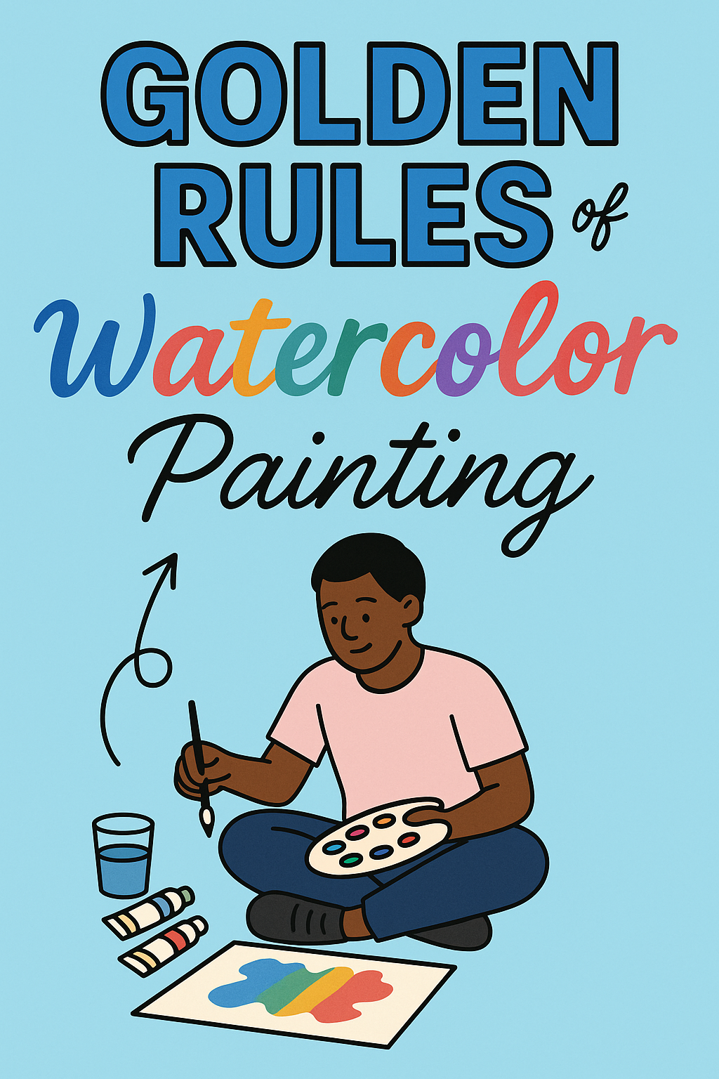
Understanding the 8 Golden Rules of Watercolor
Watercolor painting requires a different approach than other paint styles. It relies on delicate handling of light, color, and water to achieve depth and clarity. Each rule guides the watercolor artist in controlling these elements while maintaining the medium’s unique transparency and flow.
Mastering these principles helps an artist create vibrant and well-balanced paintings with intentional layers and color choices.
Work From Light to Dark in Watercolor
Watercolor paints are naturally transparent. This means light passes through the paint and reflects off the paper. Starting with light colors first preserves highlights and prevents later colors from obscuring earlier layers.
The rule “work from light to dark” means applying pale washes or light tones before darker shades. For example, an artist paints the light red and yellow areas of an apple first. Then, shadows and darker colors are added in layers.
This method avoids overpainting and helps maintain the painting’s luminosity. Dark colors are harder to cover once applied, so save these for later stages.
Preserve the White of the Paper
The white of the paper is essential in watercolor painting. Unlike other paints where white is added, in watercolor, white comes from the untouched paper.
Leaving paper areas clean makes the painting appear bright and glowing. Artists plan ahead to keep whites as highlights or reflections. Attempting to paint white over colors usually leads to dull results.
Masking fluid or careful brush control helps preserve these whites. This practice supports the golden rule of watercolor by protecting the painting’s light and transparency.
Embrace Watercolor Transparency
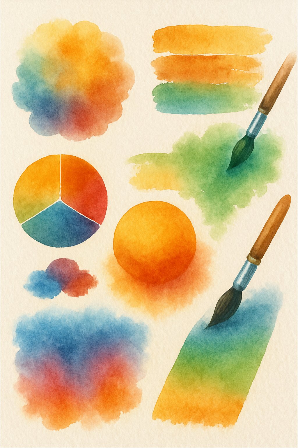
Transparency is the defining feature of watercolor paints. Colors are made by layering transparent washes, not thick layers.
Artists must accept this characteristic, avoiding heavy paint application. Each layer shows previous layers beneath it, creating rich, glowing color effects.
Using clear water to thin paints adjusts transparency. This technique allows for glazing—applying multiple translucent layers that add depth without losing brightness.
Watercolor artists achieve subtle textures and color blends by valuing transparency as a core strength.
Plan Your Colors and Brushstrokes
Color choice influences mood and composition. Watercolor artists think carefully about color schemes such as complementary or analogous colors. This planning makes the painting harmonious and appealing.
Brushstrokes also affect the final look. Combining smooth washes with controlled detail strokes defines shapes and textures.
Mixing watercolor paints on a palette ahead of time helps control the color intensity. Planning helps avoid muddy colors caused by unwanted mixing on paper.
Deciding where to place hard or soft edges shapes the viewer’s focus and adds interest.
Allow Watercolors to Dry Between Layers
Watercolor painting often involves building layers, but patience is key. Each layer must dry fully before the next is added.
Applying a new wet layer on damp paint can cause unwanted blending or bleeding. Waiting prevents muddy colors and keeps shapes clear.
Drying times vary depending on humidity and paint thickness. Some artists use hair dryers for speed but should avoid overheating the paper.
Proper drying maintains the clarity of individual layers and supports control over light and shadow.
Build Up Layers for Depth
Layering is how watercolor artists create richness and form. Light washes are applied first, then darker or more intense colors follow.
Each transparent layer adds visual depth. This process mimics how light interacts with surfaces, enhancing realism.
Artists must plan the order of layers carefully. The goal is to keep the painting balanced without overworking it.
Patience and control during layering help enhance texture, shadows, and highlights.
Balance Water and Pigment Ratios
The amount of water mixed with pigment changes a paint’s transparency and intensity. Too much water makes colors pale and uncontrollable. Too little water results in thick, uneven patches.
Watercolor artists learn to adjust these ratios for different effects, whether smooth washes or textured strokes.
Keeping a consistent balance helps maintain uniform color and avoids streaks or unwanted blooms.
Understanding water and pigment balance is foundational to successful watercolor painting.
Let Watercolor Create Unexpected Effects
Watercolor is unique because of its unpredictable nature. Sometimes pigment flows and mingles in surprising ways.
Instead of resisting this, watercolor artists often use these spontaneous effects creatively. Blending edges, soft gradients, or subtle blooms can add vitality and interest.
Allowing the paint to move naturally can produce textures that are hard to achieve with other paints.
Trusting the medium’s behavior makes the painting process more dynamic while still following core rules.
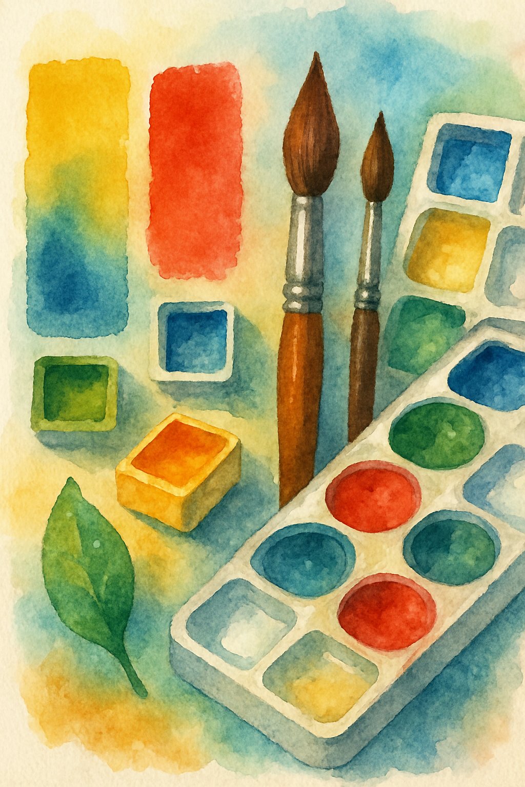
Choosing the Right Watercolor Materials
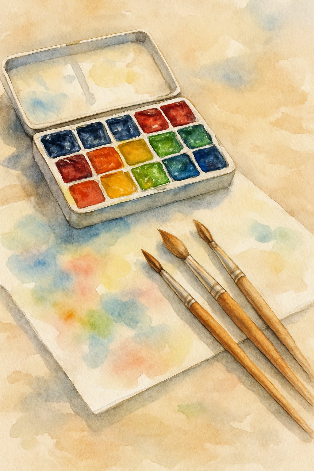
Choosing the right materials is essential for successful watercolor painting. The type of paint, paper quality, and brushes all impact how colors appear and how easily they blend. Proper tools support control, precision, and the transparency unique to watercolors.
Types of Watercolor Paints
Watercolor paints come mainly in three forms: pans, tubes, and liquid. Pans are dry, convenient for travel, and easy to control. Tubes offer more pigment and allow for richer colors, ideal for mixing larger washes. Liquid watercolors are highly concentrated and vibrant but require careful dilution.
Watercolor paints vary by transparency and pigment quality. Transparent paints work well for layering and glazing, while more opaque paints like gouache create bold, solid areas. Artists should know their paints’ characteristics to use each effectively.
Choosing student-grade or professional-grade paint affects color strength and permanence. Professional paints usually have higher pigment content and better lightfastness, meaning colors stay vibrant longer.
Importance of Quality Watercolor Paper
Watercolor paper is made to hold water and pigment without buckling or tearing. The most common types are hot-pressed (smooth), cold-pressed (textured), and rough. Cold-pressed paper is versatile and popular for most painting styles.
The paper’s weight is critical. Thicker paper (typically 140 lb or 300 gsm) withstands multiple washes without warping. Thinner papers need stretching or mounting before use, which can be difficult for beginners.
High-quality paper absorbs water evenly, preserving the transparency of watercolor paints. Lower quality papers often cause uneven drying, color blotches, or bleeding. Cotton fibers improve durability and texture, making cotton paper preferred by many artists.
Selecting the Best Brushes
Brush choice affects how paint spreads and blends. Watercolor brushes are often made with natural hairs or synthetic fibers. Natural hairs like sable hold water well and offer fine control, but synthetic brushes are more affordable and durable.
Brush shapes include round, flat, and mop brushes. Round brushes with pointed tips allow for detailed work and broad strokes. Flat brushes are good for washes and sharp edges. Mop brushes hold large amounts of water, useful for wet-on-wet techniques.
Choosing the right size matters. Smaller brushes work well for detail; larger brushes cover more area quickly. Brushes with a good spring and point provide better control and smoother paint flow. Regular cleaning prolongs their lifespan and saves money.
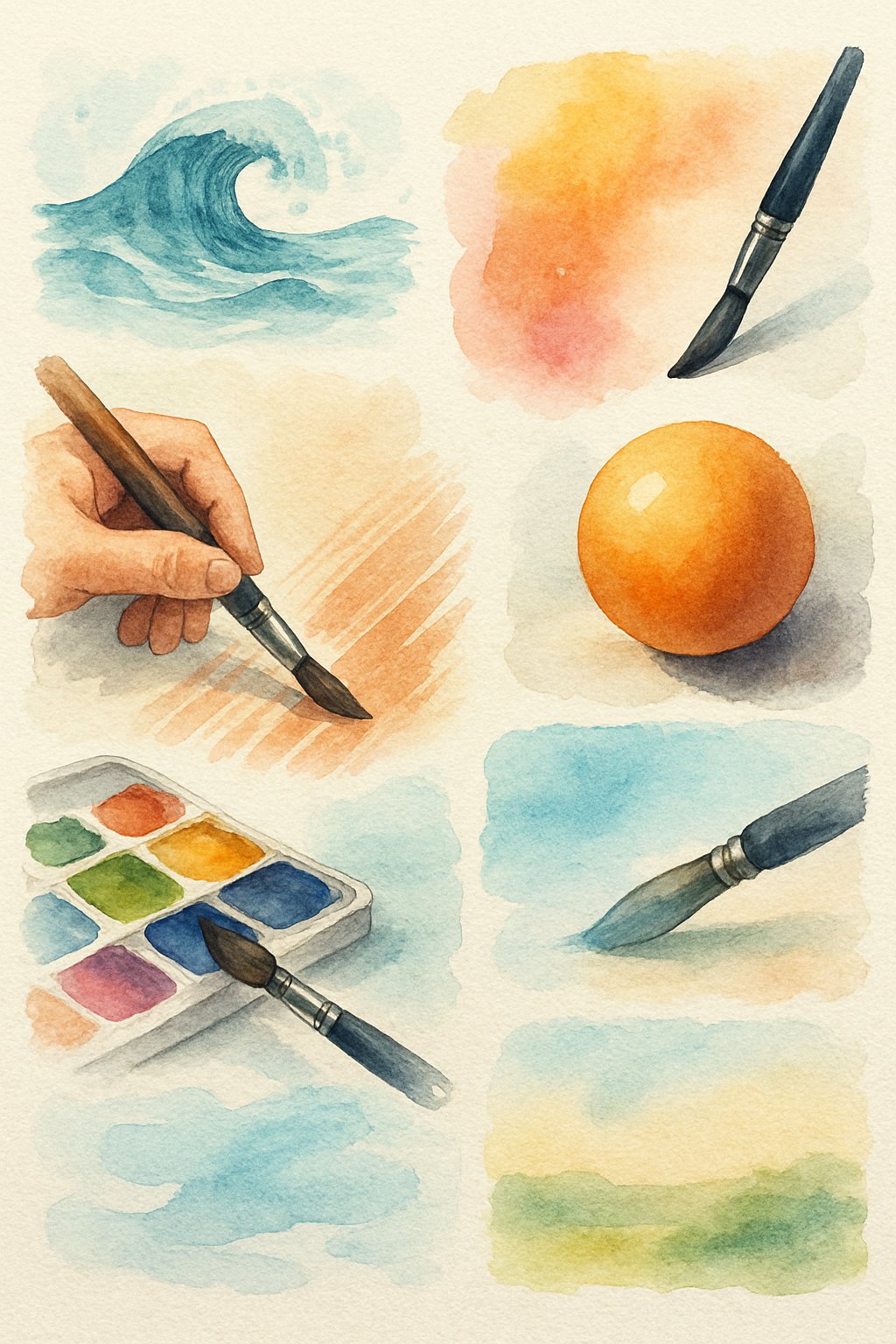
Mastering Essential Watercolor Techniques
To create strong watercolor art, an artist must control how paint interacts with paper and water. Techniques like wet-on-wet, wet-on-dry, masking fluid use, dry brush, and glazing determine texture, depth, and detail in a painting. Understanding these methods helps artists shape their work intentionally.
Wet-on-Wet and Wet-on-Dry Applications
Wet-on-wet means applying wet paint onto wet paper. This causes colors to blend softly and flow into one another. It is best for creating smooth backgrounds, skies, or soft edges without harsh lines. The result is a natural, diffused look.
Wet-on-dry involves painting wet color on dry paper. It gives more control and sharper edges. This technique suits details, shapes, and layering darker colors over lighter ones. It allows the artist to build structure and form in the painting.
Mastering when to use each technique helps control color mixing and the final texture of the artwork.
Using Masking Fluid Effectively
Masking fluid is a liquid that protects parts of the paper from paint. When dry, artists can paint freely over it without affecting the masked area. Removing it later reveals clean, white spaces or previous layers.
It is essential to apply masking fluid carefully with an old brush or a special applicator. Use it on dry paper before any paint. Once the surrounding paint dries completely, peel off the masking fluid gently to avoid damaging the paper.
Masking fluid is critical for preserving highlights, sharp edges, or small details like light reflections in watercolor art.
Dry Brush and Glazing Techniques
Dry brush uses a brush with little paint and water, applied to dry paper. This creates a textured, scratchy effect, ideal for fine details like hair, grass, or rough surfaces. It adds contrast and visual interest.
Glazing means layering transparent washes of paint over dry layers. Each layer changes the color depth gradually without disturbing the previous ones. It builds richness and complex color effects.
Both techniques require patience and control. Dry brush adds texture; glazing adds depth. Together, they allow a watercolor artist to refine and enhance their work carefully.
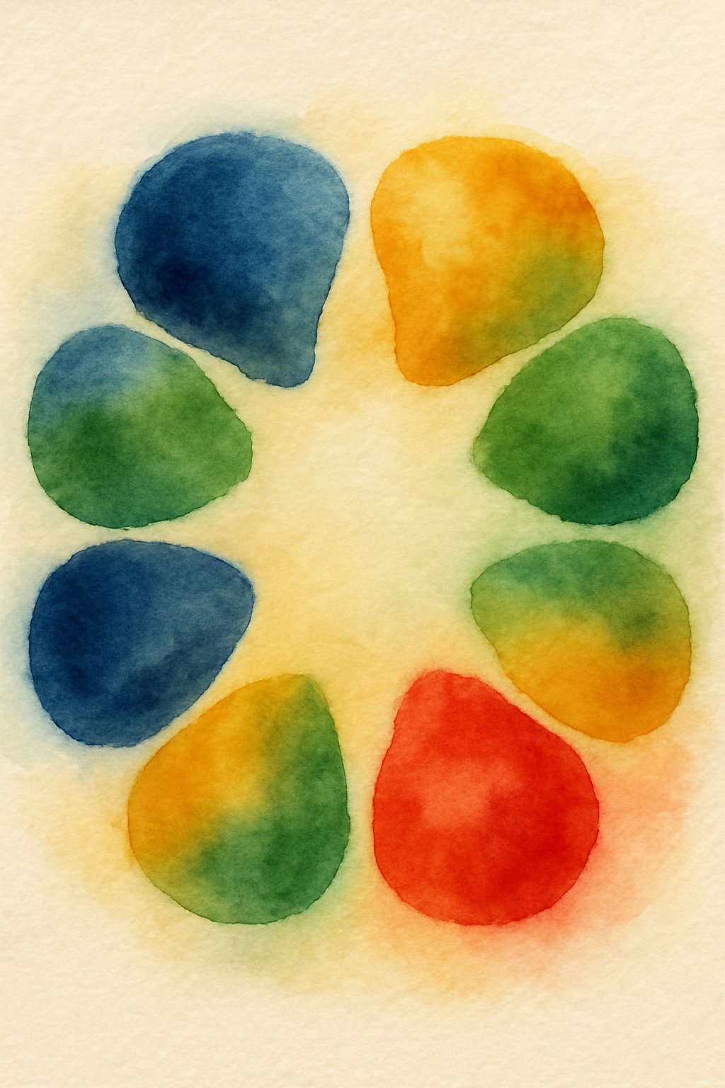
Color Theory for Watercolor Artists
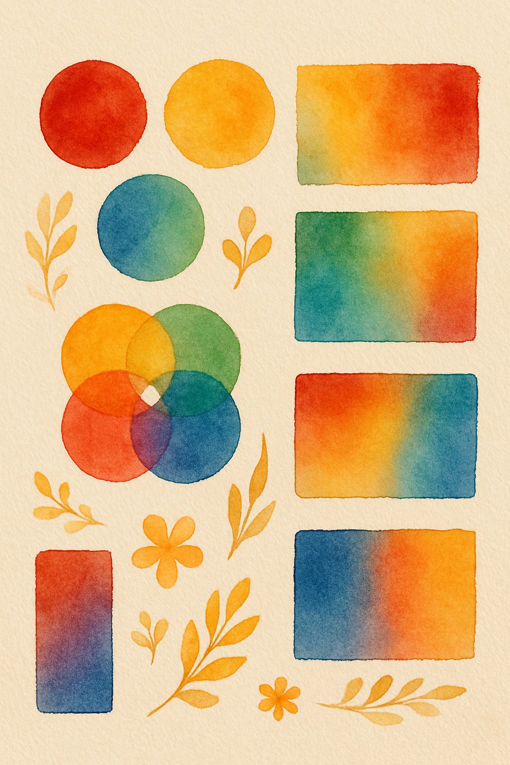
Color theory helps watercolor artists choose and mix colors for balanced and appealing paintings. It explains how colors relate to each other and how to create effects like contrast or harmony. Understanding these ideas lets artists control the mood and focus of their work.
Understanding Complementary Colors
Complementary colors are pairs of hues opposite each other on the color wheel. Examples include red and green, blue and orange, or yellow and purple. When placed side by side, these colors create strong contrast and make each other stand out.
Using complementary colors in watercolor paintings can add vibrancy and depth. However, mixing them directly often results in dull or neutral tones. Artists usually apply one color in a bright area and the other nearby in shadow or background to balance intensity.
Recognizing complementary pairs helps artists control color temperature and mood. It allows them to emphasize key elements while keeping the palette lively and engaging.
Mixing Watercolor Paints
Mixing watercolor paints involves combining primary colors like red, yellow, and blue to create secondary and tertiary colors. The paint’s transparency allows layers to blend, producing glowing effects.
Water-to-pigment ratio controls color intensity. More water creates lighter, delicate washes; less water results in darker, richer colors. Adjusting this ratio is essential for creating contrast and details.
Artists often mix small amounts first to test new colors before starting their painting. Keeping colors clean and avoiding muddy mixtures ensures clarity. Understanding how pigments interact helps artists predict the outcomes and plan their work effectively.
Developing Harmonious Color Palettes
Harmonious palettes use colors that naturally work well together, either from the same color family or based on balanced color schemes. Triadic, monochromatic, and analogous palettes are common choices.
A triadic palette selects three colors evenly spaced on the color wheel, such as red, yellow, and blue. This creates variety with balance. Monochromatic palettes use variations of one color with different tones and intensities, generating unity and softness.
Artists blend harmonious colors to maintain visual flow and mood. Thoughtful palette choices prevent conflict between hues and support the painting’s emotional impact and composition.
Avoiding and Correcting Common Watercolor Mistakes
Watercolor painting requires control over pigments and water to keep colors clear and shapes defined. Mistakes often come from using too much paint or water, or adding too many layers. Knowing how to stop these errors early or fix them helps keep paintings bright and fresh.
Preventing Overworking and Muddy Colors
Overworking happens when an artist paints over areas too many times. This can make the colors dull and muddy. Watercolors are meant to be transparent, so layering too much paint removes that freshness. To avoid this, painting from light to dark is key. Apply the light colors first, then add darker shades slowly once the first layers dry.
If colors get muddy, it often means too many pigments mixed or the paint is thick. Using cleaner water and mixing smaller amounts of paint helps keep colors pure. When mistakes occur, lifting paint with a clean, damp brush or blotting with tissue can reduce muddy spots. Waiting for layers to dry before adding more paint also limits overworking.
Managing Water and Pigment Control
Balancing water and pigment is crucial in watercolor. Too much water causes streaky washes and weak colors. Too little limits flow and blending. Artists should learn their brush and paper’s absorbency to adjust water amounts properly.
Using a test sheet to try out washes before painting the final work helps control this balance. When the paint pools or creates hard edges, it usually means uneven water application. To fix this, gently tilt the paper or soften edges with a damp brush. Mastery of water and pigment allows for smooth, even washes and sharp details where needed.
| Tip | Effect | Fix or Prevention |
|---|---|---|
| Too much water | Faint colors, streaks | Use less water, tilt paper |
| Too much pigment | Dark, thick, blotchy paint | Dilute paint, clean brush often |
| Overworking layers | Muddy, dull colors | Paint light to dark, lift paint early |
| Uneven water application | Hard edges or unwanted marks | Blend with damp brush |