iPads offer many ways to make the home screen look and work better. Users can add widgets and customize app layouts to create a personal and efficient space. This article explores ideas for organizing and styling iPad screens using widgets and app arrangements.
Customizing the iPad screen helps improve access to important information and makes the device easier to use. Different layouts and widget choices allow users to match their preferences and needs. These changes can make the iPad feel more useful and visually appealing.
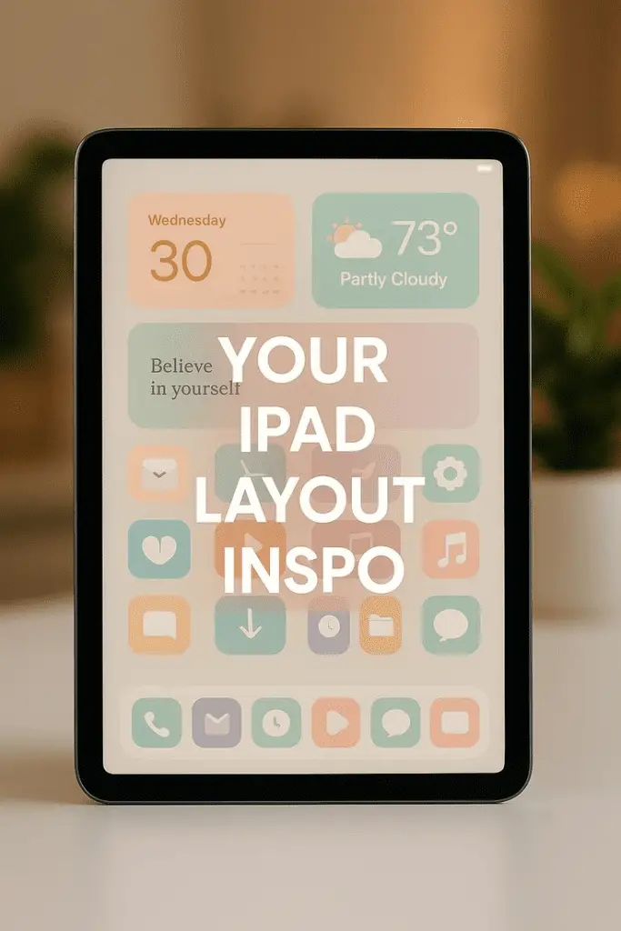
1) Use stacked widgets for weather and calendar integration

Stacked widgets are a smart way to keep important information visible without using too much screen space. By stacking weather and calendar widgets, users can quickly see current weather conditions and upcoming events in one place.
To create a stack, users tap and hold a widget, select edit mode, then drag one widget onto another. This combines them into a single block. They can then swipe through the widgets in the stack to view each one.
This method works well for people who want quick updates on both their schedule and the weather. It keeps the Home Screen clean and organized while offering easy access to key information. Users can add multiple stacks for different locations or calendars if needed.
Stacked widgets also update automatically based on time or location when using Smart Stacks. This means the content adjusts throughout the day without extra effort. It’s a practical way to enhance productivity and stay informed using iPad widgets.
2) Arrange apps with consistent color themes

Using consistent colors for app icons helps create a clean and organized look on the iPad home screen. When apps share similar colors, they blend well together, making it easier to find and use them quickly.
Users can group apps by color, placing all red, blue, or green icons in one area. This method reduces visual clutter and gives the screen a balanced feel.
Tinting app icons is another option. With iPadOS 18, people can add color tints to icons to match a chosen theme. This feature allows more control over the home screen’s style without changing the apps themselves.
Pairing colored widgets with matching apps further improves the theme. Widgets can follow the same color pattern, making the whole layout look intentional and well planned.
This consistent color approach works best when combined with simple backgrounds. Neutral wallpapers help the colors stand out without making the screen look too busy.
3) Incorporate large widgets for detailed info like news or stocks
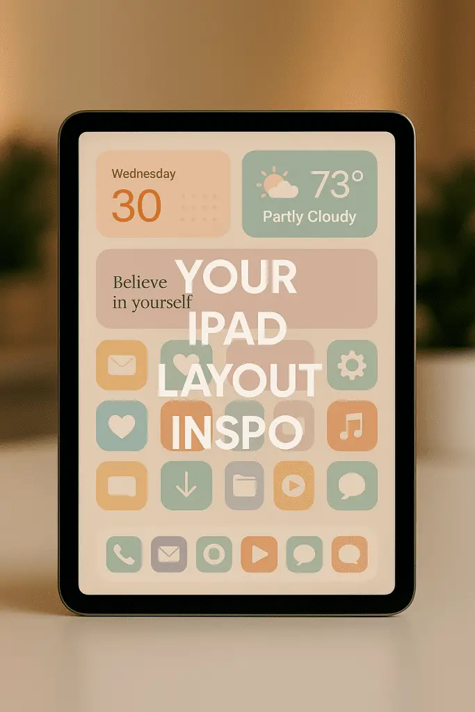
Large widgets provide more space to show detailed information at a glance. On iPads, these widgets can display multiple headlines, stock prices, or other data without opening the app.
Using big widgets for news helps users stay updated easily. They can see several stories with summaries and images, making reading faster and more efficient.
Stocks widgets benefit from larger sizes by showing price changes, trends, and multiple stocks at once. This lets users track investments directly from the home screen.

iPadOS supports different widget sizes, including large ones that take up more screen space. Users can choose the size that fits their needs best.
Adding large widgets also enhances the home screen layout. It balances space between smaller widgets and apps, creating a clean and useful view.
By focusing on detailed content in large widgets, the home screen becomes a more productive space for information and quick updates.
4) Create gaps between app icons for a minimalist look

With iOS 18 and iPadOS updates, users can now create spaces between app icons on the home screen. This feature lets people break the usual grid pattern and place icons freely. It helps achieve a clean, minimalist appearance.
Creating gaps can help highlight widgets or important apps. It also makes the screen less cluttered and easier to navigate. Users can arrange their icons to fit personal style or improve focus on specific items.
This customization does not require any third-party apps or jailbreaking. It is built into the system, offering an official and safe way to space out icons. The option works on both iPads and iPhones running iOS 18 or later versions.
Small gaps between icons add a fresh way to organize apps without adding folders or hiding items. This approach is helpful for users who prefer simple, neat screens with more white space. It can improve the overall user experience by reducing visual noise.
5) Use tinted app icons to match your wallpaper

Using tinted app icons helps create a unified look on the iPad Home Screen. By applying a color tint, users can make their icons blend smoothly with their wallpaper. This adds a subtle, stylish effect without changing the original design too much.
iPadOS 18 allows users to easily add tints to app icons. The tint color can be selected to match the dominant color in the wallpaper. This creates a clean and coordinated appearance across the screen.
Some tools include an eyedropper to pick colors directly from the wallpaper. This ensures the tint fits perfectly. Users can choose between light, dark, or tinted icon variants for different moods and lighting conditions.
Tinted icons work well alongside widgets. When colors match, widgets and apps feel like part of one cohesive setup. This approach improves the overall visual experience and makes the Home Screen more personal and pleasant to use.
6) Add widget stacks for multiple widgets in one space

Widget stacks let users place several widgets in the same spot on the iPad screen. This helps save space and keeps the Home Screen less cluttered. They can swipe through different widgets within the stack without needing extra room.
To create a widget stack, users hold an empty area on the Home Screen until the icons jiggle. Then they drag one widget on top of another. The stack will hold all the widgets added this way.
Smart Stacks are a special type of widget stack. They automatically show the most relevant widget based on time of day or app usage. This means the iPad can display weather in the morning and calendar events later without user action.
Users can also edit stacks by adding or removing widgets anytime. Scrolling through stacked widgets is done by swiping up or down inside the widget area.
Using widget stacks helps organize apps and information more neatly. It allows quicker access to multiple features while keeping the layout clean and simple.
7) Customize app icon colors for better visual grouping

Customizing app icon colors helps organize the iPad screen. Users can group similar apps by color to quickly find what they need. This method improves the overall look and makes navigation easier.
With iPadOS 18 and later, users can apply tints to app icons. They can choose light, dark, or custom colors to match their preferred style. This feature allows for clear separation of app types, like work, entertainment, or social media.
Changing icon colors also works well with widgets. When colors match widget themes, the Home Screen looks more coherent and tidy. People can make their screens both functional and visually simple.
The process of changing icon colors is straightforward. A long press on the Home Screen lets users select and adjust icon colors quickly. This small change has a big impact on managing many apps without crowding the screen.
8) Use productivity widgets like to-do lists and reminders

Productivity widgets, such as to-do lists and reminders, help users stay organized on their iPads. These widgets can be placed directly on the home screen, allowing quick access to important tasks without opening an app.
Users can choose widget sizes that fit their layout, showing a few or several tasks at once. Some widgets let users mark tasks as complete with a tap, saving time and keeping lists up to date.
Reminders widgets often sync across devices, so tasks stay consistent on iPad, iPhone, and Mac. Apps like Microsoft To Do and Todoist offer smart reminders and daily planning tools, making them useful for managing schedules and deadlines.
Adding these widgets helps turn the iPad into a productivity tool that keeps important tasks visible throughout the day.
9) Place frequently used apps in dock with widget clusters nearby

The dock on the iPad is designed for fast access to important apps. Users should place their most used apps there. This includes apps like Messages, Mail, and Photos.
Placing widget clusters near the dock helps users see useful info quickly. For example, weather, calendar, or clock widgets can show updates without opening apps. Grouping them close to the dock keeps the home screen organized.
Widgets come in various sizes. Users can choose small or medium widgets to fit neatly near the dock. This setup makes it easy to glance at essential information and switch to apps with one tap.
To arrange this, users tap and hold an app or widget until it jiggles. Then they drag items to the desired spot. Clustering widgets close to the dock saves time and makes the iPad home screen more functional.
10) Utilize the App Library for quick app access without clutter

The App Library on iPad helps keep the Home screen clean by automatically organizing apps into categories. Users do not need to keep every app visible, which reduces clutter and makes finding apps faster.
It groups apps into folders like Social, Travel, and Entertainment. This way, users can quickly access the apps they use most without scrolling through multiple screens.
Apps not used often stay in the App Library but are still easy to find. This makes it possible to keep the Home screen tidy while having all apps just a swipe away.
Using the App Library alongside widgets and the Dock creates a balanced layout. Quick access is maintained where needed without sacrificing organization or space.
How Widgets Influence iPad Home Screen Organization

Widgets add new ways to interact with the iPad’s home screen. They provide quick access to information and tools while shaping the overall layout. Their function and design help users create a balanced, efficient screen setup.
Interactive Widget Functions
Widgets are mini app windows that display real-time information, such as weather updates, calendar events, or news headlines. Users can tap or swipe on many widgets to perform actions without opening the full app, like marking a reminder done or controlling music playback.
This interactivity reduces the need to switch between apps, making tasks faster. Widgets can also be resized and placed strategically next to related apps for better workflow. For example, a calendar widget can sit near email or note-taking apps, saving time and improving organization.
Visual Balance and Grid Layout Principles
The home screen uses a grid system where apps and widgets fit together. Adding widgets of varying sizes breaks the monotony of icons and creates a more dynamic look.
To maintain balance, users should arrange widgets to avoid overcrowding one area. Grouping widgets by function or theme improves visual clarity. For example, placing productivity widgets together and entertainment widgets elsewhere helps the eye scan the screen easily.
Spacing matters too. Leaving gaps between widgets and icons creates breathing room, making the screen appear cleaner. Apple’s iPadOS allows users to reposition icons freely, enabling personalized layouts that combine function with aesthetics.
Customization Tips for Personalized iPad Interfaces

Customizing an iPad interface well means organizing apps for easy use and choosing colors that make the screen pleasant to look at. These steps help users improve efficiency and give their device a unique style.
Strategic App Grouping
Grouping apps by function or frequency can make navigation faster. Users should arrange frequently used apps on the first page for quick access.
Folders work well for grouping related apps, such as putting all social media or productivity apps together. This keeps the home screen neat and reduces clutter.
Widgets can be placed near related apps to add useful information at a glance. For example, a calendar widget next to scheduling apps saves time.
Users might also leave some space between groups for better separation. This visual break helps the eye focus and find things faster.
Using Color Themes for Cohesive Designs
Choosing a consistent color theme for app icons and widgets creates a balanced look. Users can select icons that share a similar shade or style.
Many apps allow changing icon colors or adding a tint. Matching these with wallpaper colors enhances the overall theme.
Using contrasting colors for widgets helps important information stand out without making the screen busy.
A simple way to start is to pick two or three main colors, then apply these consistently across app icons, widgets, and backgrounds.
This approach helps make the layout both attractive and easy to use.