Painting shadows in watercolor adds depth and realism to artwork, making objects look three-dimensional. Shadows are not just simple gray shapes; their colors and tones change based on the light source and surroundings. Understanding how light creates both cast and form shadows, and using the right colors instead of just black or gray, is key to painting believable shadows.
Shadows have different parts with distinct tones, including the darkest areas where light is blocked completely, and softer edges where light diffuses. Using techniques like glazing layers, mixing complementary or analogous colors, and paying attention to how light bounces in the scene helps create natural shadows that enrich the painting.
By learning to observe and replicate the way shadows fall and change color, painters can bring their work to life. Knowing how to break down complex shadows into simple shapes and colors makes the process easier and the results more convincing.
Understanding Shadows in Watercolor
Shadows are essential in watercolor paintings to create depth and form. They help give objects a three-dimensional look by showing how light interacts with surfaces. Knowing how shadows work improves the overall realism and balance of a painting.
The Role of Light and Shade
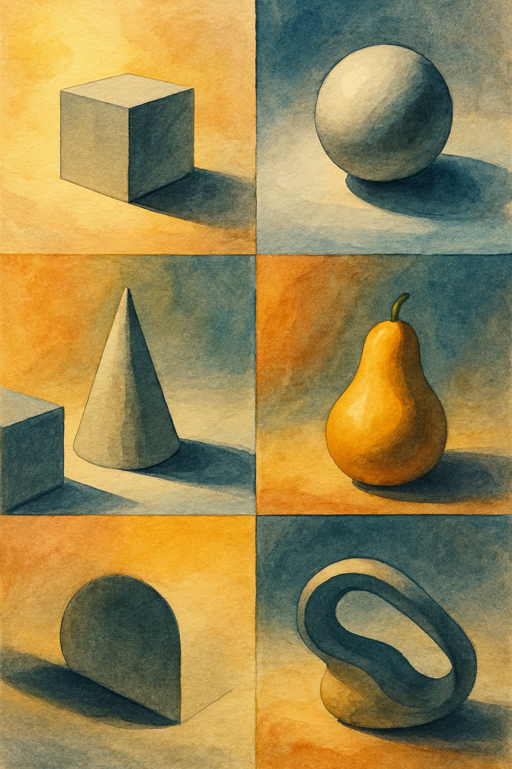
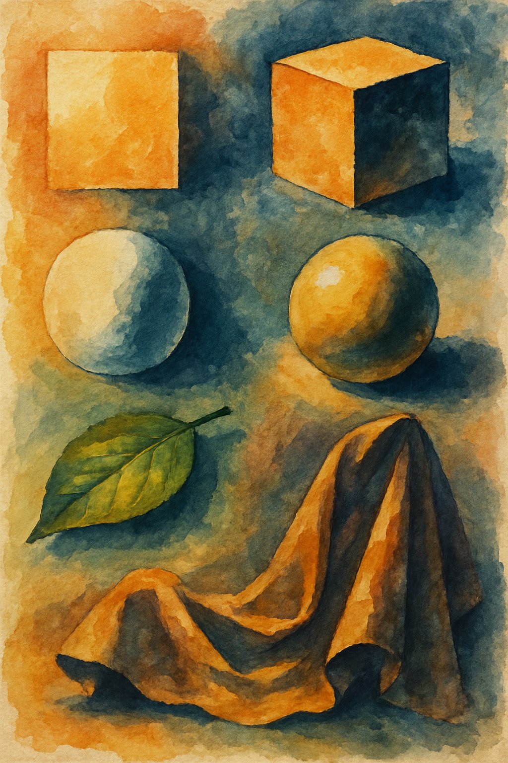
Light controls where shadows fall and how dark they appear. There are two main types of shadows: form shadows and cast shadows. Form shadows appear on parts of an object that turn away from the light. Cast shadows are the shapes objects create when blocking light on other surfaces.
The angle and strength of the light source affect shadow size, direction, and softness. For example, early morning sunlight casts long, dark shadows, while midday light softens them. Shadows usually carry a touch of color complementary to the light, like a purple hue in yellow sunlight. Understanding these details allows watercolor artists to represent shadows accurately and add realism to their work.
Planning Your Watercolor Shadows
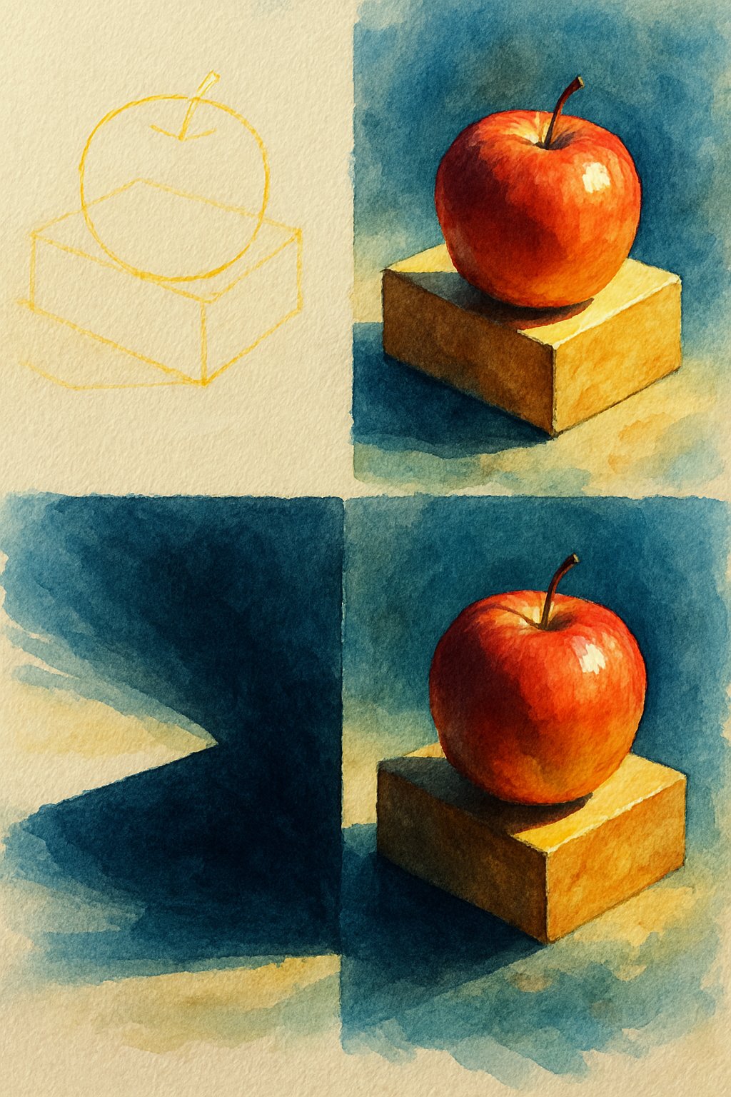
Before starting to paint shadows, it’s important to identify the light source in the scene. Knowing where the light comes from helps decide the direction and shape of the shadows. Shadows fall opposite the light, so their placement depends on this.
Artists should observe how the light creates highlights on the object. Highlights show the brightest spots where light hits directly. Mapping these areas first guides where the shadows will deepen.
Next, they must think about the types of shadows: cast shadows fall on nearby surfaces, while form shadows appear on the object’s shaded side. Each shadow type has different darkness and softness based on the light’s strength.
It is helpful to plan the edges of shadows. Shadows are usually sharp and dark near the object, then become softer and lighter at the edges. This change is due to indirect or ambient light affecting the shadow.
Artists often choose shadow colors carefully. Shadows are rarely just gray or black. They can include cool blues or purples outdoors, caused by skylight, or warmer colors from artificial light.
A simple plan:
| Step | What to Do |
|---|---|
| Identify light | Locate the light source |
| Mark highlights | Paint the brightest spots first |
| Sketch shadows | Draw cast and form shadow shapes |
| Define edges | Make shadows softer or harder |
| Choose colors | Pick shadow hues based on light |
This approach helps create shadows that look natural and add depth.
Mixing Colors for Realistic Shadows
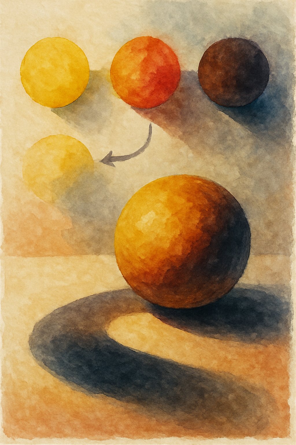
Shadows are rarely just black or gray. To create realistic shadows in watercolor, artists mix colors that reflect the light and environment around the object.
Using complementary colors deepens shadows without making them dull. For example, mixing a touch of green with red or purple with yellow works well.
Analogous colors also help create rich shadows. Adding a deeper tone like burnt sienna or quinacridone gold to a yellow object will give a warm, natural shadow.
Dark tones are key to convincing shadows. Instead of relying on black paint, it’s better to build up shadow areas gradually using layers of mixed colors.
A simple palette for shadows might include:
| Color | Use |
|---|---|
| Burnt Sienna | Adds warmth and depth |
| Quinacridone Gold | Enhances warm shadows on yellows |
| Cobalt Blue | Introduces cool tones in shadows |
| Neutral Tint | Softens shadows without color bias |
She or he can also mix a “warm black” by combining primary colors, creating shadows that feel more natural than harsh black.
Using layers and glazing helps vary shadow intensity. Darkest areas are closest to the subject, while edges soften with lighter shades, showing the effect of ambient light.
Careful color mixing maintains shadow color and avoids muddy results, helping paintings look more vibrant and three-dimensional.
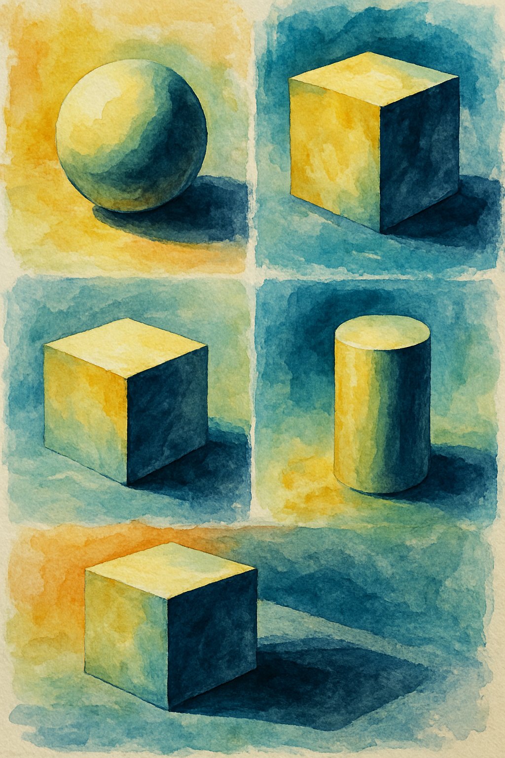
Techniques for Painting Shadows
When painting shadows in watercolor, controlling contrast is key. Shadows are darker areas, but using pure black often creates flat, unnatural effects. Instead, artists build shadows by layering colors that deepen the tone gradually.
One common technique is glazing. This involves applying multiple thin layers of paint over a dried base. Each layer adds depth without making colors muddy. Glazing helps maintain the transparency and luminosity that watercolour is known for.
Using analogous colors for shadows can enhance realism. These colors sit next to each other on the color wheel and can darken areas without clashing. For example, to shadow a yellow object, artists might add a bit of orange or green to keep shadows natural but rich.
Complementary colors add stronger contrast to shadows. Mixing a color from the opposite side of the color wheel can neutralize brightness and form believable shaded areas. For bright subjects, this trick avoids dullness and keeps the painting lively.
Sometimes, artists use a neutral tint, a mixture of colors that creates a grayish shade without bias. This is useful for muted shadows but less effective for vibrant subjects, where it can cause dullness.
Varying the shadow edges also plays a role. Near the object, shadows have sharper, darker edges, while farther away shadows soften and lighten. This variation contributes to realism and a clear sense of light direction.
By combining these techniques, painters create shadows that add depth, form, and realism to watercolor works.
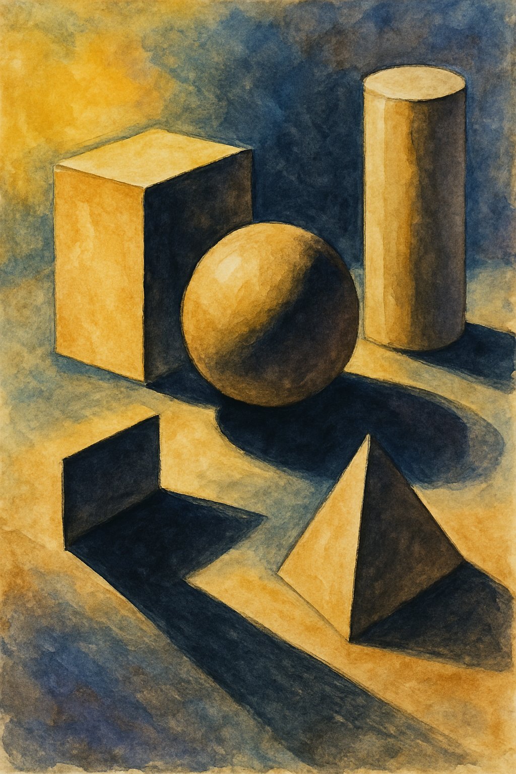
Rendering Cast and Form Shadows
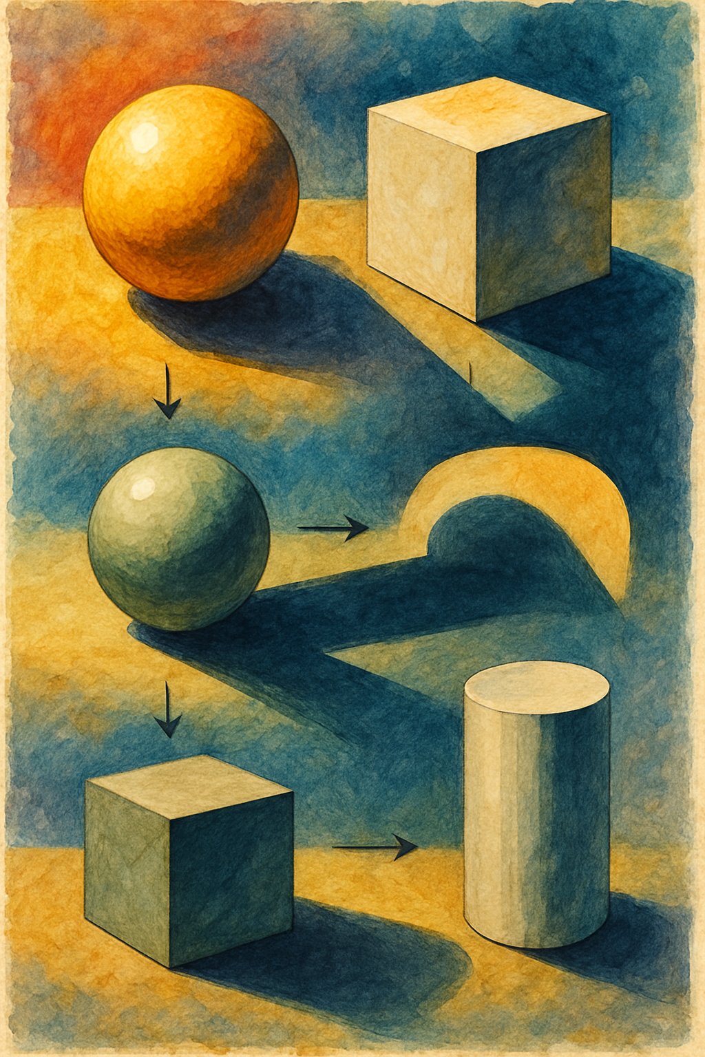
Understanding how light interacts with objects allows an artist to accurately render shadows. This involves observing how cast shadows fall on surfaces and how form shadows define the shape of the object itself. Both types of shadows require careful attention to tone, color, and edge quality to convey a sense of three-dimensionality.
Depicting Cast Shadows on Different Surfaces
Cast shadows appear when an object blocks light, projecting a shadow onto a nearby surface. These shadows are shaped by the angle and intensity of the light source.
Cast shadows often have three parts: the darkest area close to the object called the occlusion shadow, followed by a softer, lighter zone known as the penumbra. The edges near the object tend to be sharp, gradually becoming softer as they stretch away.
The color of cast shadows is influenced by surrounding light. They rarely appear pure gray. Instead, shadows often carry cool or warm tones depending on ambient light. For instance, blue hues might be present in outdoor shadows under a sunny sky due to skylight reflection.
Painting Form Shadows for Volume
Form shadows are found on the object itself where surfaces turn away from the light. These shadows define the object’s volume and its roundness or angles.
Form shadows begin at the terminator, which marks where light stops hitting the surface. From the terminator, shadows deepen gradually to the core shadow, the darkest zone on the object. This shadow usually has soft edges to suggest curved planes.
Reflected light can brighten parts of the form shadow, especially near surfaces like the ground. This light bounces back onto the object and softens shadows, adding complexity and realism.
Using subtle color shifts within form shadows helps to avoid flatness. Mixing analogous or complementary colors to the object’s base color creates richer tones and enhances the three-dimensional effect.
Enhancing Your Watercolor With Highlights and Contrast
Effective use of highlights and contrast is key to making a watercolor painting stand out. Adding bright areas next to dark tones creates depth and guides the viewer’s eye. Proper balance between light and shadow helps objects look more three-dimensional and realistic.
Balancing Light and Dark
Balancing light and dark means carefully placing highlights and shadows to shape the subject. Highlights are the brightest spots where light hits directly. They should remain crisp and often have the least amount of paint, sometimes the untouched white of the paper.
Dark tones add weight and form. Using rich, deep colors in shadows creates strong contrast with highlights. This contrast can emphasize texture and volume, making the painting more striking.
Artists often avoid using pure black for shadows. Instead, they mix dark colors from complements or analogous colors to keep shadows lively and natural. Shadow edges can be hard or soft depending on how close they are to the object, adding variety to the contrast.
In watercolor, layering dark tones with glazing builds depth without covering highlights. This technique preserves brightness while enhancing contrast, essential for realistic effects.