Pastel rainbow backgrounds have become popular for their soft, calming colors that add a gentle touch to any design. They work well in many settings, from digital art to phone wallpapers, offering a visually pleasing way to brighten up screens or projects.

This article shows seven ideas for using pastel rainbow backgrounds to inspire creativity and add charm to various designs. Each idea highlights a unique way to incorporate these soft colors, making it easier for anyone to choose a style that fits their needs.
1) Soft pastel rainbow gradient with subtle clouds

This background style features gentle rainbow colors that blend smoothly. The pastel shades include soft pinks, blues, yellows, and greens.
Light, subtle clouds add texture without overpowering the colors. The effect creates a calm and peaceful atmosphere.
It works well for digital designs, wallpapers, and posters needing a soft, dreamy look. The combination is simple but visually appealing.
2) Minimalist pastel rainbow stripes on white

This background style uses soft pastel stripes on a clean white base. The simplicity helps keep the focus clear and uncluttered.
The white space makes the pastel colors stand out without overwhelming the viewer. It suits designs that need a light, fresh look.
Minimalist pastel rainbow stripes work well for websites, presentations, and social media. They add color subtly while maintaining a modern feel.
3) Abstract pastel rainbow brush strokes

Abstract pastel rainbow brush strokes create a soft and artistic background. They blend gentle colors in a way that feels light and airy.
This style works well for digital designs, prints, and crafts. It adds a calm and creative touch without being too bold.
Artists and designers often use these brush strokes to create unique patterns and textures. The pastel shades keep the look subtle and pleasing.
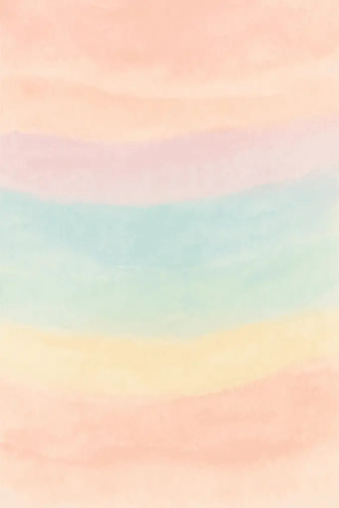
4) Watercolor pastel rainbow splash background

This background style features soft, blended colors that look like paint splashes. It uses light pastel tones to create a calm and gentle rainbow effect.
The splashes often overlap, giving a natural and artistic feel. It works well for invitations, websites, and social media posts.
The watercolor texture adds depth without being too bright. This makes the design suitable for many creative projects.
5) Geometric pastel rainbow shapes overlay

This style uses simple geometric shapes in soft pastel rainbow colors. The shapes often overlap, creating a layered effect.
The overlapping areas blend colors softly, adding depth to the design. It works well for backgrounds, posters, and digital art.
Geometric shapes keep the design clean and organized. The pastel tones make it gentle on the eyes while still colorful.
6) Pastel rainbow ombre fade effect

The pastel rainbow ombre fade effect blends soft colors smoothly from one to another. It creates a gentle transition between hues that is pleasing to the eye.
This effect is popular for backgrounds on phones, computers, and websites. It adds a calm and subtle look without being too bright or overwhelming.
Many designers use this fade effect to make images feel light and airy. It works well with pastel color palettes.
7) Hand-drawn pastel rainbow doodle pattern

A hand-drawn pastel rainbow doodle pattern adds a personal and soft touch to any design. The imperfect lines and gentle colors make it feel friendly and approachable.
This style works well for children’s art, invitations, and casual backgrounds. It often includes simple shapes like clouds and hearts alongside the rainbows.
The doodle look stands out by being unique and creative, giving projects a warm, handmade feel.
Understanding Pastel Rainbow Aesthetics

Pastel rainbow aesthetics use soft, light colors arranged in gentle gradients. These colors create a calm and pleasing effect. The choice of colors and design elements work together to make these backgrounds feel both soothing and visually interesting.
Color Theory Basics
Pastel colors come from mixing regular colors with white. This lowers the color’s intensity and makes it softer. In pastel rainbow aesthetics, colors like light pink, baby blue, soft yellow, and mint green are common. These shades are less bright but still distinct, which makes them easier on the eyes.
The pastel rainbow palette often follows the natural color order of a rainbow but in pastel shades. This means soft reds, light oranges, pale yellows, gentle greens, soft blues, muted indigos, and light violets appear in sequence. This order helps maintain balance and harmony in the design.
Popular Design Elements
Designs using pastel rainbow backgrounds often include smooth transitions and gradients. Blending colors softly rather than having harsh lines is important. This blending makes the colors flow naturally, adding to the peaceful look.
Shapes like soft curves, clouds, and subtle waves are popular in these backgrounds. They complement the gentle colors and help avoid sharp edges that can feel too strong. Light textures or minimal patterns also add depth without disturbing the calm feel.
Lists of common elements:
- Soft color gradients
- Rounded shapes or curves
- Light textures or subtle patterns
- Minimalist design to avoid clutter
Tips for Customizing Pastel Rainbow Backgrounds

Customizing pastel rainbow backgrounds requires careful choices in color and design to keep the look soft and balanced. The background should complement other design elements without overwhelming them. Consider key details to ensure harmony and visual appeal.
Choosing the Right Color Balance
The colors in a pastel rainbow background should be soft and muted to create a gentle effect. Using too many bright or dark tones can make the design look harsh or busy. It is best to select two or three main pastel colors and blend them smoothly using gradients or soft transitions.
A good method is to use colors opposite each other on the color wheel, but keep their saturation low. This gives contrast without clashing. Adding white or light gray shades helps to soften the overall look.
Balance the use of each color to avoid one dominating the design. For example, a large area in soft lavender paired with small touches of pastel peach and mint green offers variety without clutter.
Matching Backgrounds With Visual Content
The pastel rainbow background should work well with the main images or text on the design. If the background uses light pastel shades, the text or visuals should be in darker but complementary colors for clear readability.
Keep busy patterns or intricate images away from important content areas. Soft gradients or simple shapes in the background create a calm space that highlights foreground elements.
Designers can use overlay layers with reduced opacity to mute areas behind text blocks. This enhances contrast and keeps the message easy to read.
When placing photos or icons, choose color tones that echo the pastel hues. This unifies the style and avoids visual disconnect.
Key points to remember:
- Use muted colors with low saturation
- Balance color amounts carefully
- Ensure high contrast for text or key visuals
- Simplify background near important content
- Match visual content colors with background shades