Watercolor backgrounds add a unique touch to art and design by creating soft, flowing color effects that enhance any project. Many artists and creators use these backgrounds to bring life and depth without overwhelming the main subject.

The best watercolor background ideas help users achieve beautiful results with simple techniques anyone can learn. These ideas can inspire beginners and experienced artists alike to explore new ways of using color and texture in their work.
1) Gradient wash with soft pastel hues
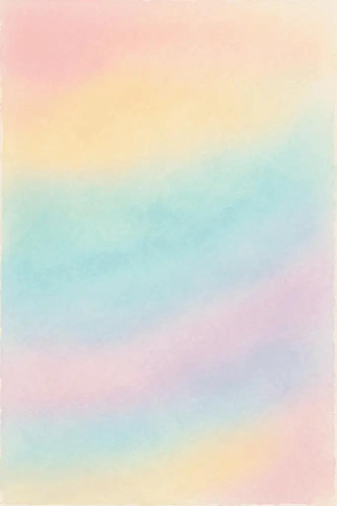
A gradient wash blends colors smoothly from dark to light or between soft pastel shades. This technique creates gentle backgrounds with a calm, balanced look. It works well for skies, flowers, and subtle abstract designs. The key is to keep the paint wet and blend carefully for even transitions.
2) Wet-on-wet technique for blurred edges

The wet-on-wet technique involves applying wet paint onto a wet surface. This causes the colors to spread and blend softly. It creates natural blurred edges without sharp lines.
Artists use this method to make smooth backgrounds and gentle color transitions. It is useful for a soft, fluid look in watercolor paintings.
3) Layered transparent washes for depth

They apply thin, see-through layers of paint on dry paper. Each layer adds color without hiding the one beneath. This technique creates more depth and subtle color changes in the background.
It needs patience and care to wait for each layer to dry. The result shows gradual build-up and natural brightness.
4) Salt texture effects on wet paint

The salt texture technique involves sprinkling salt onto wet watercolor paint. The salt absorbs water and pigment, creating unique patterns and textures as the paint dries. Different types of salt can produce varied effects, adding depth and interest to backgrounds. It works best on paint that is wet but not too watery.
5) Splatter technique for dynamic backgrounds

The splatter technique uses flicking or tapping a loaded brush to create random paint spots. It adds texture and movement to a background without detailed work. Artists can use different colors and brush sizes to control the look while keeping it lively and unpredictable.
6) Ombre fade from dark to light tones

The ombre fade technique uses one color that gradually changes from dark to light. It creates a smooth, subtle transition that adds depth to the background.
Artists often start with the darkest shade and slowly add water or lighter paint to achieve the fade effect. This method works well for soft, natural backgrounds.
7) Using masking fluid for sharp shapes

Masking fluid helps preserve white areas or sharp shapes in watercolor backgrounds. It acts as a protective layer, stopping paint from covering certain spots. Artists apply it before painting and remove it once the paint is dry to reveal clean, crisp edges.
Fundamental Techniques for Watercolor Backgrounds

Creating effective watercolor backgrounds involves controlling water and paint flow, managing layers of color, and choosing colors that work well together. These elements help bring depth and balance to any painting.
Wet-on-Wet Application
Wet-on-wet is a technique where the artist applies wet paint onto wet paper or onto a wet layer of paint. This allows colors to spread and blend softly, producing smooth transitions and organic textures.
The key is to prepare the paper evenly with water before adding pigment. The amount of water affects how far the paint spreads. More water leads to softer edges, while less water keeps colors more defined.
Using this technique, it’s possible to create natural effects like clouds, fog, or soft backgrounds quickly. The result is a fluid, unpredictable look, so artists must work with patience and openness to unexpected patterns.
Layering and Blending
Layering involves applying multiple thin washes of watercolor, allowing each to dry before adding the next. This builds depth and richness in the background.
Blending happens when colors gently merge on the paper, usually while still damp. Controlled blending can soften hard edges and create smooth gradients.
To avoid muddy colors, artists should let layers dry completely before adding new colors. This keeps each layer distinct and bright.
Using glazes—transparent layers of paint—can help adjust tones and add complexity without covering previous work fully.
Color Harmony Principles
Choosing harmonious colors is essential to create balanced watercolor backgrounds. Colors that work well together can enhance the overall mood and focus of a painting.
Artists often use analogous colors (colors next to each other on the color wheel) for a smooth, calming effect. For example, blues and greens blend naturally.
Complementary colors (opposites on the color wheel) introduce contrast and can make elements stand out but should be used carefully to avoid clashing.
Understanding warm versus cool colors helps set the tone. Warm colors like red and orange convey energy, while cool colors like blue and purple provide calmness.
Keeping the color palette limited helps maintain consistency and prevents distractions in the background.
Creative Approaches and Enhancements

Exploring unique techniques can enrich watercolor backgrounds. Experimenting with textures and materials adds depth and interest. Using complementary tools and effects can shift a simple wash into a vivid, engaging piece.
Integrating Mixed Media
Mixed media combines watercolor with other materials like ink, pencil, or collage. Adding ink lines or doodles over a soft watercolor wash gives structure and detail to the background.
Textured papers or layering pieces of paper create physical depth. Artists can also include acrylic paint or pastels to highlight certain areas. This contrast draws the eye and enhances the overall design.
Using mixed media requires planning. The artist should consider drying times and how each material interacts. Combining these elements thoughtfully can turn a basic watercolor background into a complex, unique composition.