Many people use their iPads for work, creativity, and everyday tasks. The way the home screen is set up can affect how easily they access apps and stay organized. Customizing the home screen helps users make the device fit their style and needs.

iPad home screen ideas focus on combining functionality and aesthetics to improve user experience. This makes it easier to find apps, manage tasks, and enjoy the device’s appearance. Simple changes can create a more productive and enjoyable interface.
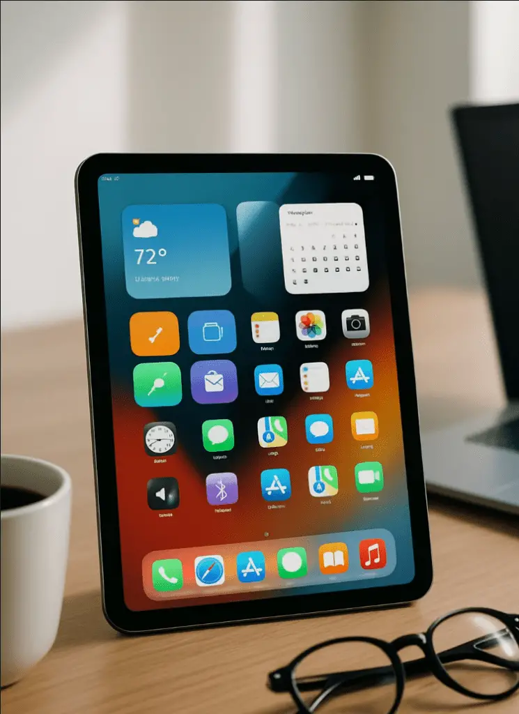
1) Use Widgetsmith for customizable widgets

Widgetsmith is a popular app for making personalized widgets on the iPad homescreen. It allows users to create widgets in small, medium, and large sizes. These widgets can show things like time, weather, calendar events, or photos.
Users can customize the look of each widget by changing colors, fonts, and styles. This flexibility helps make the homescreen unique and organized. It also fits different themes or color schemes the user prefers.
To use Widgetsmith, one simply opens the app, picks a widget size, and designs it by selecting options inside the app. After saving the widget, they add it to the homescreen by entering edit mode and choosing Widgetsmith from the widget list.
This tool is useful for people who want more control over their homescreen layout without complicated steps. It works well with the latest iPadOS versions, offering smooth integration and easy adjustments any time.
2) Create personalized app icons with Apple’s Shortcuts app

Users can customize app icons on their iPad using Apple’s Shortcuts app. This allows for a personalized home screen without changing the actual apps. The Shortcuts app creates shortcuts that open apps when tapped, but with new icons chosen by the user.
To start, one must open the Shortcuts app and tap the “+” symbol to create a new shortcut. Then, they select the “Open App” action and choose the app to open. After that, they tap “Add to Home Screen.”
Users can tap the icon to select a custom image. They may use photos from their library or take new pictures to use as app icons. Once done, the shortcut appears on the home screen with the chosen icon.
This method is useful for personalizing the look of the iPad. However, it does not replace the original app icons, which remain on the device. Shortcuts simply act as a new way to launch apps with custom visuals.
3) Set up multiple home screens using Focus modes

Focus modes let users create different home screen layouts for various tasks or moods. Each Focus mode can show specific app pages and hide others. This helps reduce distractions by only showing relevant apps and widgets.
To set this up, users first create multiple home screens. Each screen can have its own apps, widgets, and wallpaper. Then, in Settings, they go to Focus and select a Focus mode, like Work or Relax.
Next, they enable the Custom Pages option and choose which home screens appear for that Focus mode. When the Focus mode is activated, the iPad switches automatically to the assigned screens.
Users can also automate Focus modes using the Shortcuts app. For example, switching home screens based on the time of day or location. This makes managing multiple setups easier.
Using Focus modes with multiple home screens helps keep an iPad organized. It fits different needs, such as work, entertainment, or rest, by changing what appears on the screen.
4) Incorporate vibrant wallpapers with bold colors

Using vibrant wallpapers with bold colors can instantly change the look of an iPad home screen. Bright colors catch the eye and create a lively atmosphere.
Patterns like abstract neon shapes or colorful geometric designs add energy and style. These wallpapers make an iPad feel modern and fresh.
Bold colors also help app icons stand out, making it easier to find apps quickly. Users often choose wallpapers that match their favorite colors to create a personal touch.
Nature-inspired wallpapers with bright greens, blues, or warm tones can provide a refreshing feel while still offering bold color choices.
Overall, picking a vibrant wallpaper helps set the mood of the home screen. It can make everyday use more enjoyable without needing complex changes.
5) Adopt a minimalist layout with soft pastel backgrounds

A minimalist layout helps keep the iPad home screen clean and easy to navigate. Soft pastel backgrounds add a calm and gentle touch without being distracting. This combination creates a balanced look that feels modern and simple.
Using pastel colors like light pink, mint green, or soft blue can make the screen look fresh. These colors work well with minimalist app icons and widgets. They help highlight important apps while keeping the overall design subtle.
Minimalist layouts usually reduce clutter by limiting the number of apps on the screen. Users place apps in neat rows or grids and use widgets sparingly. This approach makes the home screen more efficient and visually pleasing.
Adding pastel backgrounds with minimal icons can also reduce eye strain. It gives the user a peaceful space to focus on tasks. This style suits people who prefer a relaxed and organized device setup.
6) Add Calendar and Weather widgets for quick info

Adding Calendar and Weather widgets to the iPad home screen helps users get key information at a glance. These widgets show upcoming events and current weather conditions without needing to open separate apps.
The Calendar widget displays scheduled meetings, reminders, and important dates. Users can choose from different sizes to see more or less detail based on their needs.
Weather widgets provide updates on temperature, forecasts, and weather alerts. Different sizes allow for quick sky conditions or extended forecasts right from the home screen.
Placing these widgets together creates an efficient space that keeps users informed throughout the day. Both widgets are easy to add by selecting them from the widget gallery and positioning them on the home screen.
This setup is especially helpful for planning ahead and staying aware of changes in the weather, improving daily productivity and convenience.
7) Use the TomToc Inspire-Pivot Case for ergonomic setup

The TomToc Inspire-Pivot Case offers a practical way to improve iPad ergonomics. It features an adjustable pivot stand that lets users set the iPad at different angles. This helps reduce neck and wrist strain during long use.
The case is designed to hold the iPad Pro securely while allowing stable support on any surface. Its pivot design adapts to various scenarios like typing, drawing, or watching videos. This flexibility makes it easier to maintain good posture.
Additionally, the case provides reliable protection with a slim build. It can handle drops up to 5 feet without adding bulk. This means users can confidently carry their iPad while keeping it well protected.
Overall, the TomToc Inspire-Pivot Case combines ergonomic benefits with strong protection. It is a useful accessory for those who want to set up their iPad home screen comfortably and efficiently.
8) Include a To-Do List widget to boost productivity

Adding a To-Do List widget to the iPad home screen helps users keep track of tasks without opening any apps. It shows upcoming tasks or reminders at a glance, making it easier to stay organized throughout the day.
Users can choose from different widget sizes, showing anywhere from three to seven tasks. They can mark items as complete right from the widget, saving time and keeping their list up to date.
Many To-Do List widgets also allow customization, such as changing themes, fonts, and layouts. This helps users make the widget fit their style and needs, improving their overall productivity.
With a To-Do List widget always visible, the iPad becomes a better tool for managing projects, schoolwork, or daily chores. It reduces the chances of forgetting important tasks and keeps priorities clear.
9) Arrange apps by usage frequency for efficiency

Arranging apps based on how often they are used helps save time. Users can place their most used apps on the first page of the Home Screen. This makes access quick and easy without scrolling through multiple pages.
Less-used apps can be moved to later pages or placed in folders. Grouping these apps keeps the screen neat and lowers clutter. This method allows the iPad to be more organized for daily activities.
Frequent use apps include email, calendar, messaging, or productivity tools. By focusing on these first, users spend less time searching and more time working or enjoying their device.
This technique improves workflow and reduces distractions. It is simple to do by dragging and dropping apps on the screen. Adjusting the layout as usage changes keeps the Home Screen efficient over time.
10) Utilize iPadOS 18 aesthetic customization features

iPadOS 18 offers new ways to personalize the home screen with both function and style. Users can rearrange app icons freely and even change their tint colors. This helps create a unique look tailored to personal taste.
The update also allows different wallpapers for the home screen and lock screen. This adds flexibility to the device’s appearance and lets users express different moods or themes.
Widgets have become more versatile in iPadOS 18. They can be placed anywhere on the home screen, blending smoothly with app icons and wallpapers. This makes the screen both useful and visually balanced.
By mixing these features, users can build home screens that are clean, colorful, or minimal. The tools are designed to fit many styles while keeping the iPad easy to use.
Key Principles for an Optimized iPad Home Screen

An optimized iPad home screen combines easy access to important apps with a clean and attractive layout. The right setup boosts efficiency while keeping the device simple to use. It requires balancing looks, productivity tools, and features that make the device accessible to everyone.
Balancing Functionality and Aesthetics
A useful home screen is not just about how it looks but also how well it works. Users should organize apps so that frequently used ones are easy to reach. Grouping related apps into folders helps reduce clutter.
Visual appeal can be improved with widgets that show information at a glance, like weather or calendar events. Choosing a consistent color scheme or background enhances the screen’s overall look. However, it is important to avoid overloading it with too many icons or widgets, which can overwhelm and slow down navigation.
Simple arrangements with clear icons and balanced spacing create a cleaner, more inviting workspace that makes it easier to find and open apps quickly.
Customizing for Productivity
Customizing the home screen for productivity means placing essential tools and apps front and center. Widgets for reminders, notes, or to-do lists keep tasks visible and easy to update.
Users can arrange apps by task or priority, such as putting work-related apps on the first page and leisure apps on later pages. This setup supports focus and reduces distractions.
Folders and the App Library help keep the home screen organized. Reducing the number of screens by limiting apps to only the most important also speeds up access and saves time when switching tasks.
Accessibility Considerations
An accessible home screen meets the needs of all users, including those with visual or motor challenges. Features like larger app icons and adjustable widget sizes improve visibility and ease of use.
Using simple layouts with clear labels helps users quickly locate the right app without confusion. High-contrast backgrounds and icon tints can further support users with vision impairments.
Custom gestures and shortcuts are useful for those who find taps or swipes difficult. Ensuring most-used features are reachable with minimal effort helps create a more inclusive experience for all users.
Using Widgets and Custom Shortcuts Effectively

Widgets and shortcuts can make the iPad Home Screen more useful. Proper placement, stacking, and creating shortcuts help save time and keep the screen tidy. Each strategy focuses on making information and tools quickly available without clutter.
Widget Placement Strategies
Widgets should be placed where they are easy to glance at and use. Important widgets like calendar, weather, or notes belong near the top or sides where the eye naturally falls. Less used or decorative widgets can go toward the bottom.
Grouping widgets by function improves workflow. For example, place work-related widgets together and entertainment widgets separately. Using empty spaces strategically can also give a cleaner look without overwhelming the screen.
Adjusting widget sizes helps too. Larger widgets for detailed info, smaller ones for quick updates. This balance keeps the layout clear and efficient.
Best Practices for Widget Stacks
Widget stacks save space by layering multiple widgets in one spot. Users can swipe through different widgets without filling the screen with too many icons.
Stacks should group similar widgets. For instance, combine news widgets or different calendar views to keep related content accessible but condensed. Avoid mixing unrelated widgets in one stack as it causes confusion.
Naming stacks or ordering widgets by priority lets users find what they need quickly. Regularly updating stack contents keeps the Home Screen relevant to current tasks or interests.
Creating Time-Saving Shortcuts
Custom shortcuts automate tasks and open apps faster. Users can create shortcuts for actions like messaging, starting timers, or adjusting settings quickly.
Shortcuts should target daily or repetitive tasks to maximize their value. For example, one shortcut could open favorite apps at work or start a playlist for exercise.
Placing shortcuts on the Home Screen or in widget stacks makes them easy to reach. Clear names and simple icons improve identification and reduce hesitation during use.